Banners in all sizes and variations are popular advertising displays at exhibitions. Pop-up towers make an excellent addition to any display setup by providing 360° visibility. In this tutorial, we will explain what is important when using this 2 m + advertising tower and how to design it.
The tower is 2.25 m high and has a diameter of 64 cm, providing an area of nearly 5 sqm to get your marketing message across. It can be set up in no time without any tools. Magnetic pop-up towers stand out from the standard range of exhibition displays.
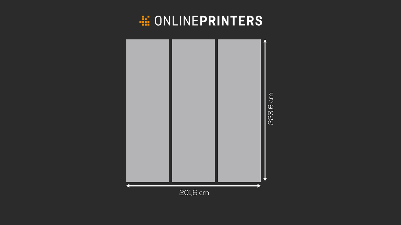
The design area of the pop-up tower consists of three identically sized printed PVC panels. The panels are mounted to the tower frame using magnetic strips and locks to yield a smooth and virtually seamless advertising area.
PVC with or without lamination is used as printing substrate. It produces crisp and clear colours and can be wiped clean easily with a cloth and warm water.
Key data of the pop-up tower:
- Collapsible frame made of matt black aluminium with hinges and magnetic locks
- Three printed panels 67.2 cm wide and 223.6 cm high
- Total size of the printed area: 223.6 x 201.6 cm
- Substrate: 350 μm PVC (satin-gloss) or 440 μm PVC with lamination
- Weight: approx. 16.5 kg
- Delivered in a trolley with a separate compartment for the printed panels
Pop-up tower design tips
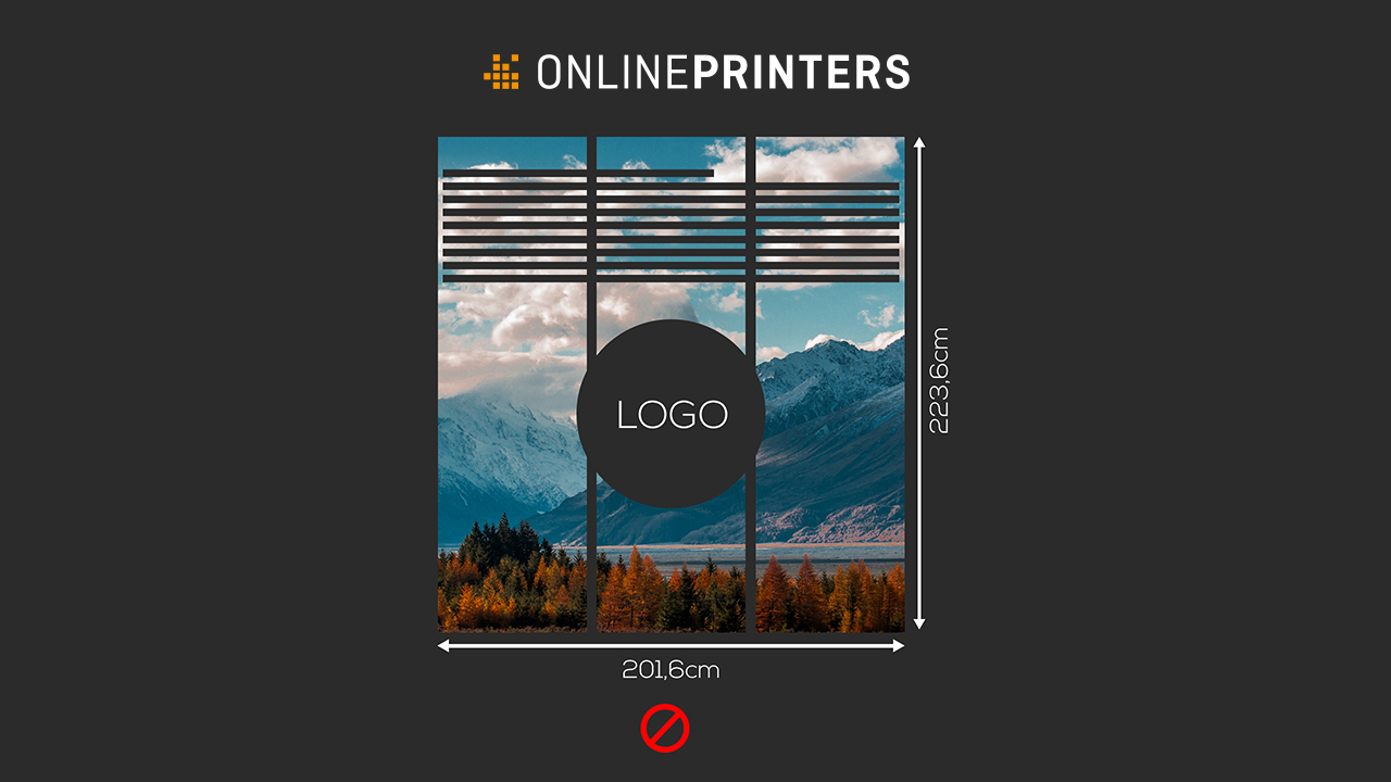
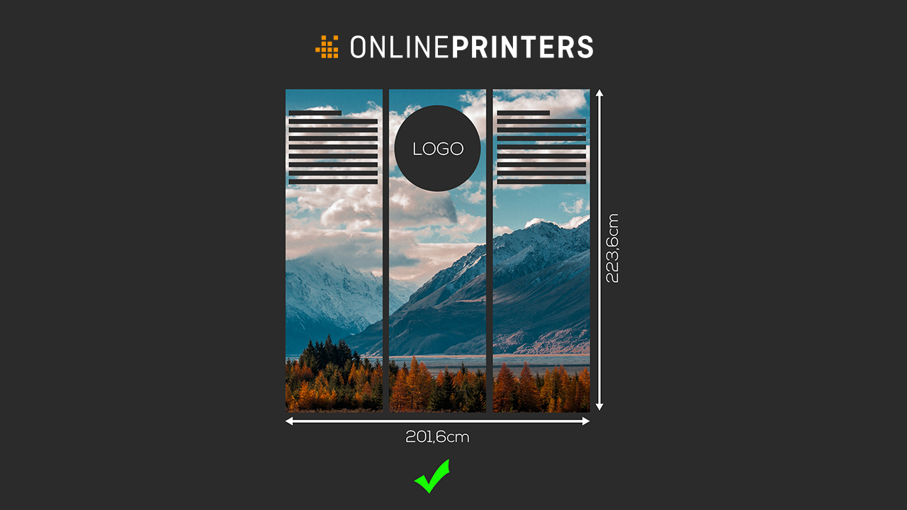
When designing the pop-up tower, you have to bear the shape in mind: It is cylindrical with a circular base area. Due to the curved surface of the pop-up tower, the observer only sees a part of tharound the tower, the observer has to circle it.
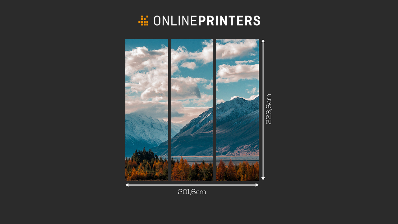
The tripartite design area provides some orientation here. The background design can easily stretch across the whole of the canvas. The three panels can be used as natural boundaries between parts of the design to account for the curvature.
Design idea: Visual property as an eye-catching element
You can deliberately use the curved shape of the area for your purposes to draw the attention of your (prospective) customers and partners and make them curious about your brand.
Designing a pop-up tower for an exhibition
Now let’s get started with the design. We create a clean and reduced design for an exhibition stand.
Step 1: Download template
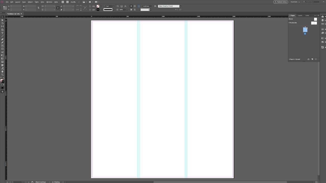
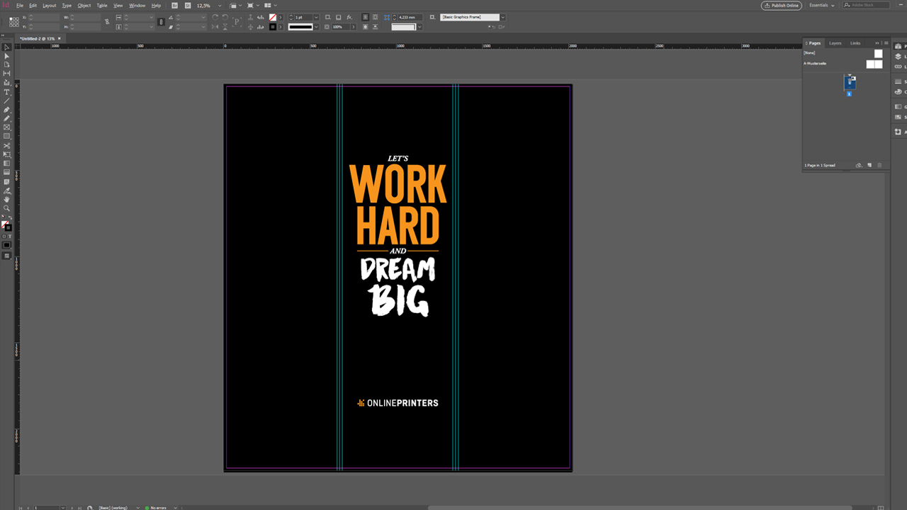
We will use the InDesign template available on the “Details” tab of the product page of the pop-up tower in the online shop. It includes all the settings we need for our artwork file: The final format is 201.6 x 223.6 cm. Adding the circumferential bleed, this yields an artwork size of 202.0 x 224.0 cm.
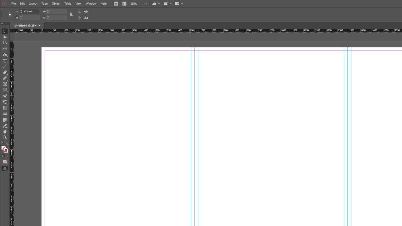
Open the template in InDesign to start the design process. The trim line is represented by guides. The additional guides on the right and left indicate the safety margin. Important information such as text and logos should be positioned at some distance to the trim edges.
Step 2: Design the area
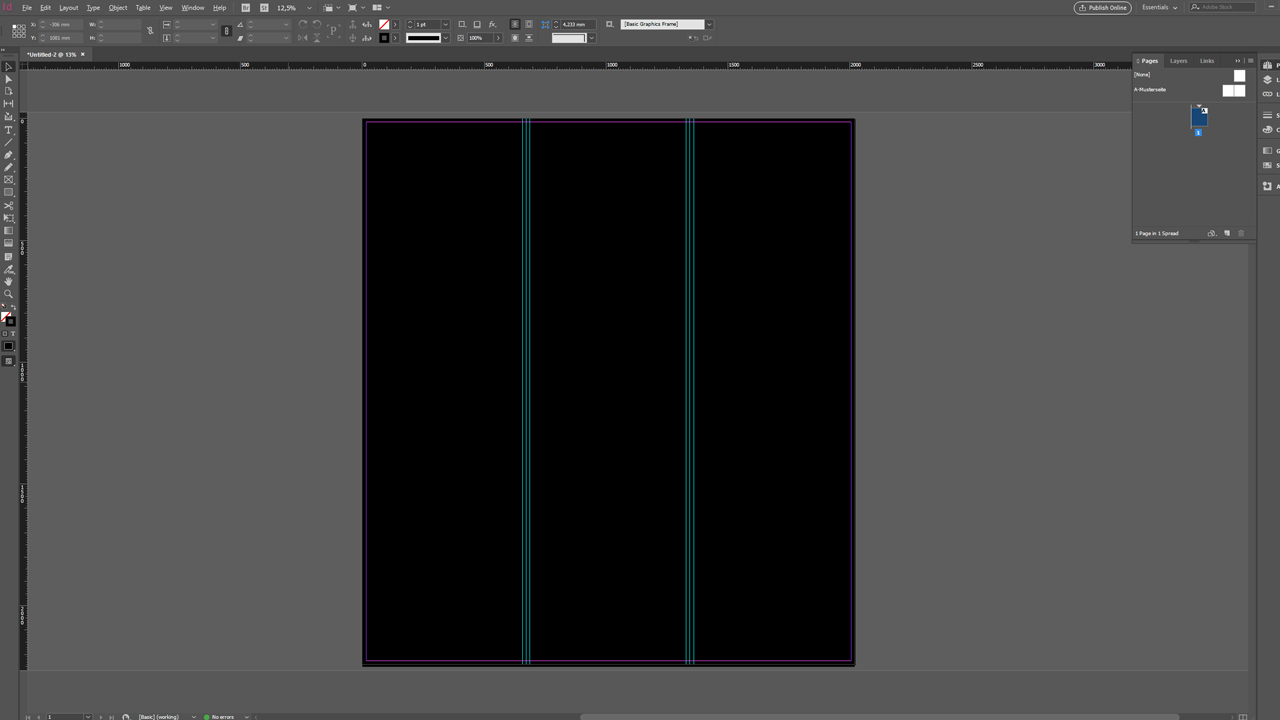
Now fill the design area completely with a black background as the basis of the minimalistic design.
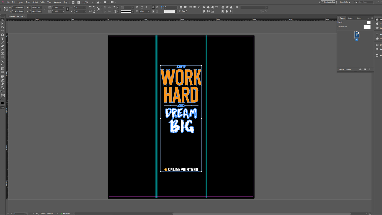
The next step is our company logo which is positioned in the lower third of the middle print panel. It is combined with our campaign slogan: LET’S WORK HARD AND DREAM BIG! The campaign slogan uses Helvetica font and a trendy Brush font. The colour design is based on the Onlineprinters corporate colours black and orange.
The result is a simplistic pop-up tower design which emphasizes the message of our campaign slogan.
Step 3: Export the artwork as PDF
Thanks to our template, exporting the artwork as a PDF file is a breeze. Press Ctrl + E to open the Export dialog box and click Export. All required export settings are preloaded in the template.
Have fun designing this XXL advertising tower.
How to set up the pop-up tower:
Credits:
Designed and presented by media designer Christoph Ullrich.
