Calligraphy font with a certain swing

0

The art of writing beautifully is still in vogue, which is why calligraphy writing enjoys great popularity in many areas. Those who do not want to write themselves can find fonts in a wide variety of styles on the internet. We present some that they may use commercially.

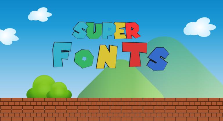
Use Super Mario font

0

This font has a high recognition value among generations of Nintendo players. So their attention is already guaranteed – and for the older ones, a pleasant feeling of nostalgia.

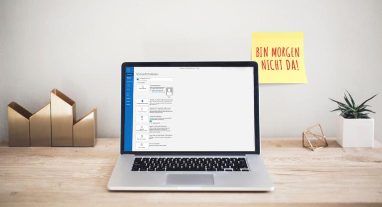
Create and Set Up Microsoft Outlook Away Notes with Free Templates

0

Whether holiday, business trip or change of company – an automatic reply by mail is a good choice for any type of absence. Do you need a suitably worded absence note quickly? With us you will find many practical tips and free text templates for your next absence from the office

A company newspaper to better help employees identify with their company

A company newspaper is a very effective internal communication tool that can also help to strengthen the company’s image. But what does it actually have to offer in order to achieve its objectives?

2022 World Cup: fixture schedule templates for your marketing

21 November 2022 will soon trigger the football mania again – kick-off will be at 11:00 a.m. German time. Whether you watch the games on your TV at home, in your local pub or at a live open-air screening, the cheers will be heard around the globe. Draw your customers’ and partners’ attention to your company with the World Cup 2022 fixture schedules from ONLINEPRINTERS.

Komma im Einsatz (Schreibregeln Teil 14)

Kommaregeln auf die Schnelle

In der deutschen Sprache setzt man das Komma in erster Linie nach grammatikalischen Regeln; seit der neuen Rechtschreibung gibt es aber viele Fälle, in denen das Setzen optional ist. Vorgesehen ist das Komma

  • bei Aufzählungen

  • bei dem Satz nachgestellten Zusätzen

  • zum Abgrenzen von Nebensätzen

  • beim Gliedern zum Beispiel von Datumsangaben und von Partizip- und Infinitivgruppen

  • bei Nachschüben

Das Dezimalkomma, also das Komma als Dezimaltrennzeichen, kommt zum Beispiel bei Preisen vor.

Das Komma im Einsatz

Grundsätzlich setzt man das Komma ohne Zwischenraum direkt nach dem letzten Buchstaben. Auch in der französischen Sprache, in der man viele Satzzeichen mit einem Zwischenraum nach dem letzten Zeichen platziert, steht es direkt am Buchstaben.

Ersetzt wird das Komma je nach Inhalt hin und wieder vom Gedankenstrich. Man bevorzugt den Gedankenstrich dann, wenn in der gesprochenen Sprache eine Pause verdeutlicht werden soll und das Komma nicht stark genug wirkt.

Form und Stand des Kommas

Die Form des Kommas ist identisch mit der des Apostroph. Es erinnert also je nach Schriftart an eine 9 wie zum Beispiel bei der Didot. In vielen Schriften neigt es sich von rechts oben nach links unten, wie zum Beispiel bei der Titillium. Alternativ steht es – wie zum Beispiel bei der Arial – auch senkrecht, und nur das Ende erhält eine leichte Rundung.

Verschiedene Kommata-Formen in verschiedenen Schriften:
die Didot, die Titillium und die Arial.

Die vertikale Ausrichtung erfolgt an der Grundlinie. Bei einer Tropfenform liegt der obere runde Teil des Tropfens direkt auf der Grundlinie, und von dort führt der Bogen von dort nach unten weg. Nicht tropfenförmige Varianten wachsen von der Grundlinie aus in etwa gleich nach oben und unten.


Schreibregeln in der Mikrotypografie

Teil 1: Mikrotypografie: Grundlagen der Schreibregeln
Teil 2: Gedankenstrich
Teil 3: Anführungszeichen
Teil 4: Apostroph
Teil 5: Semikolon
Teil 6: Klammer
Teil 7: at-Zeichen

Teil 8: Scharfe S
Teil 9: Fragezeichen
Teil 10: Ausrufezeichen
Teil 11: Paragrafenzeichen
Teil 12: Copyright-Zeichen
Teil 13: Gradzeichen
Teil 14: Komma (dieser Artikel)


Bildquelle: Arina Kumysheva via Shutterstock.com

The small font size basics

12

The size of a font influences both the legibility and the effect of the text. But what exactly is font size? Where is it measured, and why are the letters of a Times font larger than those of an English script font, even though you enter exactly the same size value?

“The Lord of the Ring” fonts straight from Middle-earth

0

“The Lord of the Rings” font is as well-known as Tolkien’s books and the spectacular film adaptations. Read on to learn how to use these fonts and what other fonts Middle-earth has in store.

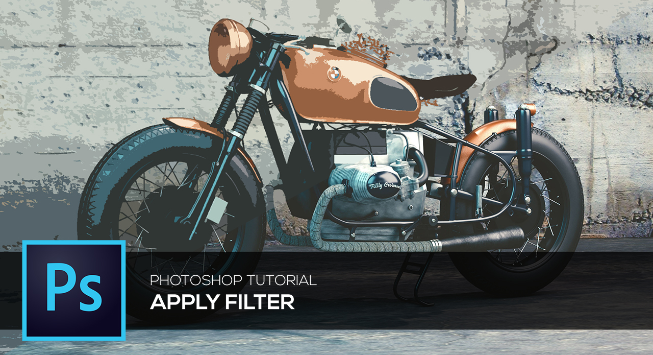
Photoshop filters and their applications – Basics Tutorial

Using filters to edit photos is an essential element of Adobe’s graphics editor. There are filters to change colour, add blur or create completely new image effects. Photoshop offers a virtually unlimited variety of filters for this purpose. In this video tutorial, we will introduce you to three different filters and explain how to apply them to your images with just a few clicks.

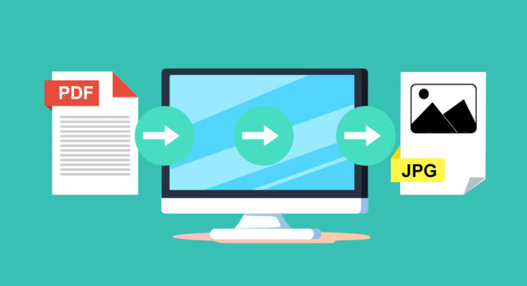
Converting PDF to JPG: different ways to get there

0

How to convert a high-resolution PDF file to a JPG with reduced file size? We show you different solutions to convert your PDF to JPG – with and without Adobe Acrobat Pro, computer functions and using helpful online tools.