Promotional items are a staple at most exhibitions and events today. The ballpoint pen is one of the most popular giveaways on such occasions. To make sure the ballpoint pen achieves the desired impact, a few key points have to be observed. In this tutorial, you will learn all about the workflow from vectorizing the logo to selecting spot colours and placing your logo.
Before starting to design ballpoint pens, there are a few things to consider. Thanks to their flexibility, pens make great promotional gifts. Due to the pen’s size, you only have a limited design area to work with. What is more, a special printing technique is employed to print on pens and this makes complex designs impossible. Therefore, it is recommended to print a company logo or brand image on pens. To make sure that the result meets your expectations, you have to follow a specific design workflow and observe the instructions from your print shop.
Content:
- The printable area with the template to download
- The printing technique: How a ballpoint pen is printed
- Getting your logo ready for print
- Step 1: Vectorizing the logo (automatically in Illustrator, hiring an agency or without Adobe tools)
- Step 2: Adjusting the logo to the printable area
- Step 3: Defining the logo colour and setting up white print
- Step 4: Converting the CMYK colour of the logo to a Pantone spot colour
- Step 5: Exporting the logo
- Step 6: Checking the artwork
The printable area
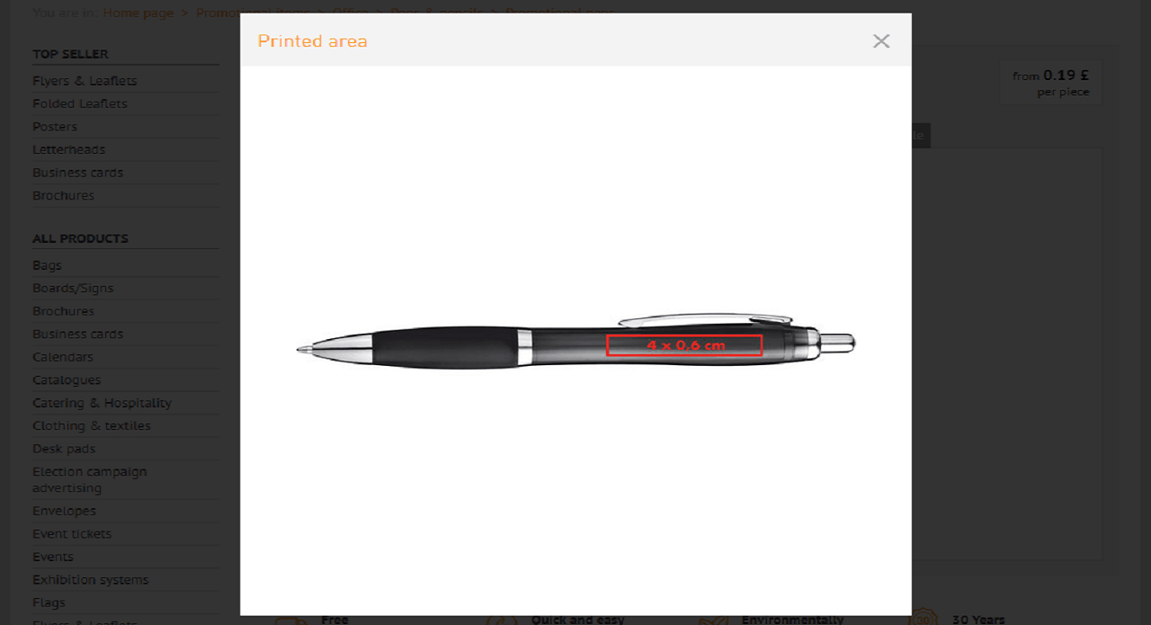
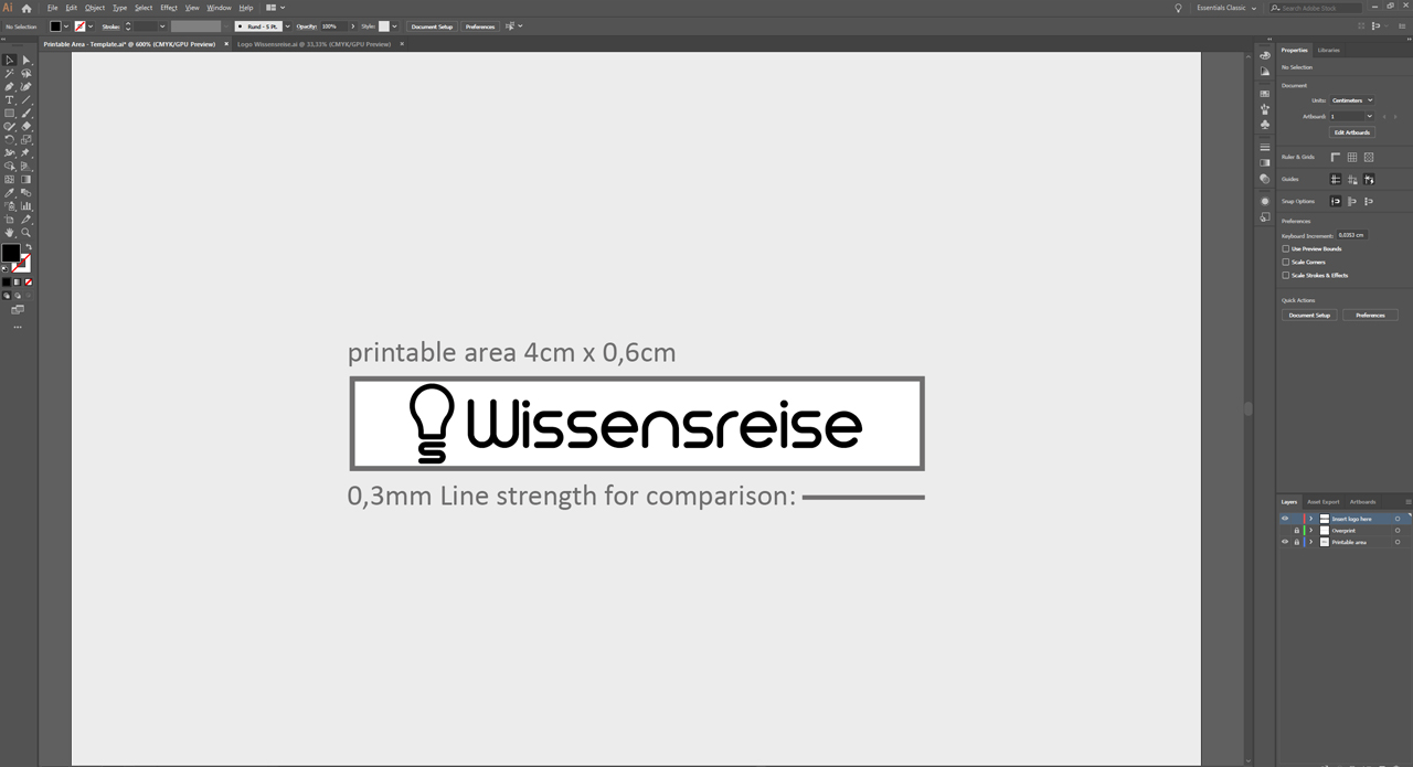
The Onlineprinters web shop carries a varied selection of printable ballpoint pens. The different pen models provide different dimensions of printable area. Most ballpoint pens available at Onlineprinters can be printed on an area of 4 x 0.6 cm. So first check the size of the printable area on the pen model you chose by clicking on Details in the upper right menu of the product configuration and open the preview of the ballpoint pen. Bear in mind that the printable area is slightly curved due to the shape of the pen.
Template to download (4 x 0.6 cm and 4 x 0.7 cm)
To make the work easier, you can download our Illustrator and PDF template with a printable area of 4 x 0.6 cm and 4 x 0.7 cm.
How a ballpoint pen is printed
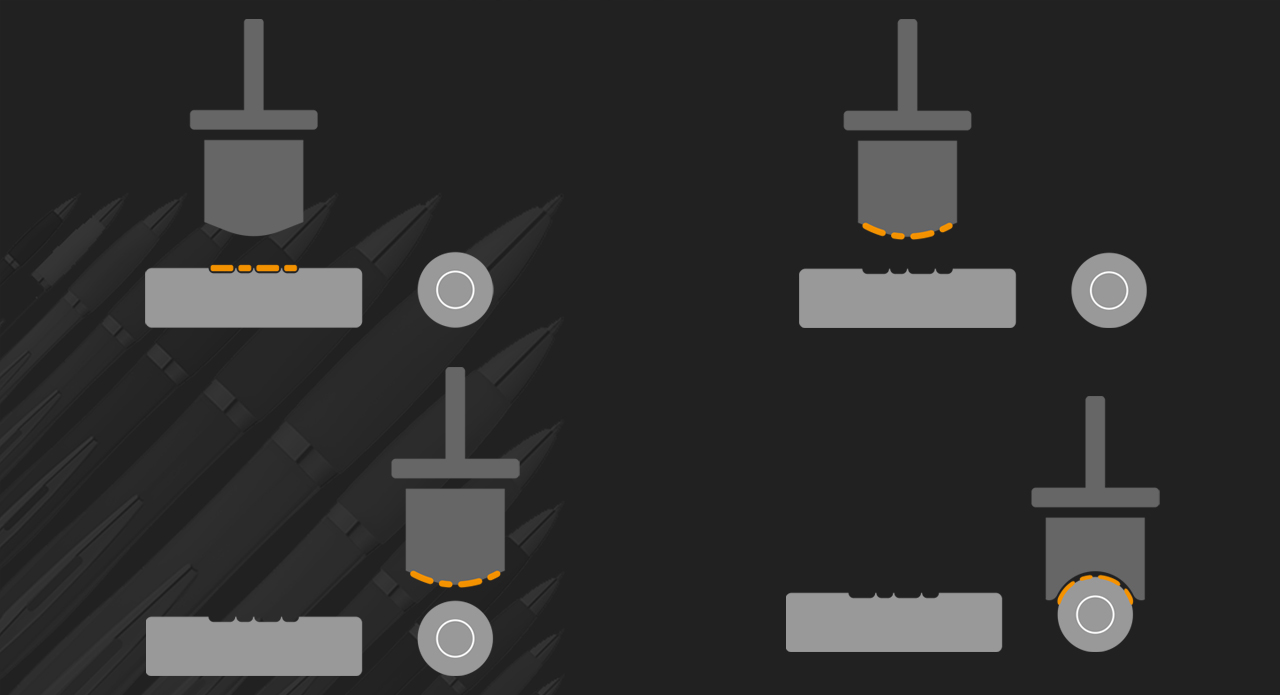
A pen cannot pass through a printer like a sheet of paper. Rather it is printed using a special technique called pad printing where an image is transferred onto the pen using a flexible pad. With this printing method it is not possible to print complex designs using the standard inks cyan, magenta, yellow and black (CMYK). For pad printing, you can choose up to two spot colours from the Pantone Solid Coated Colours range that are mixed for your print project.
Example project: Preparing the ‘Wissensreise’ logo for print
In our example, we want to get the ‘Wissensreise’ logo ready for print and adjust it to the design area available on the ballpoint pen. The logo is originally available as a raster graphic in CMYK. To print smoothly, the logo first needs to be converted to a vector graphic and adjusted to the printable area in the template. Next, define the spot colours and export the print project as a PDF file.
Step 1: Vectorizing the logo
The logo in the example is originally a raster graphic in CMYK. To print correctly, the logo must not be composed of pixels but of small mathematical curves to allow it to be scaled up or down without quality loss.
Vectorizing a logo automatically in Illustrator
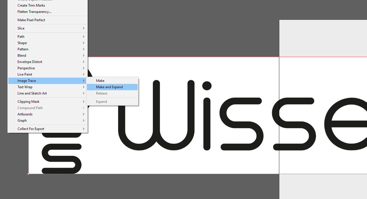
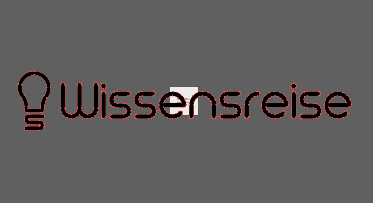
To vectorize the logo, first open a new document in Adobe Illustrator or use the above template which includes the printable area to save one work step. Photoshop and Illustrator are linked so you can simply drag your logo without the background from Photoshop and drop it in Illustrator. Illustrator is a vector-based graphic editor which vectorizes raster graphics automatically. For this purpose, click Object > Image Live Trace > Make and Expand. The program automatically recognizes the outlines of your logo and vectorizes them.
Please note that the performance of this function varies considerably with the quality of your logo. It may happen, for instance, that automatic vectorization creates excess anchor points resulting in ugly edges.
So it is vital to check your logo after it has been vectorized automatically to exclude, and if necessary, remedy conversion errors.
To create ideal conditions for automatic vectorization in Illustrator, you should provide for maximum contrast between the logo and the background. It is helpful to first colour the logo black and then convert it in Illustrator.
Hiring an agency
If your logo is too complex to be vectorized automatically or if you do not have Illustrator, you can hire a specialist agency or a graphic designer to do the job for you. They will professionally reconstruct your logo manually so you can use it for other purposes as well.
Vectorizing a logo without Adobe tools
If you don’t have an Adobe tool to vectorize your logo, you can also convert it using
- online tools (e.g. vectorization.org)
- or redraw it manually using offline programs.
For more details on these methods and the eligibility of your logo for vectorization, visit the Onlineprinters Support Centre.
Vectorization.org is a free service which delivered relatively good results in our tests. But bear in mind that you can only use online vectorization tools for laser engravings and monochrome pad and screen prints. Also make sure to specify the spot colour in the file name (e.g.: Your project name_Pantone 14-00216 Lint).
Step 2: Adjusting the logo to the printable area
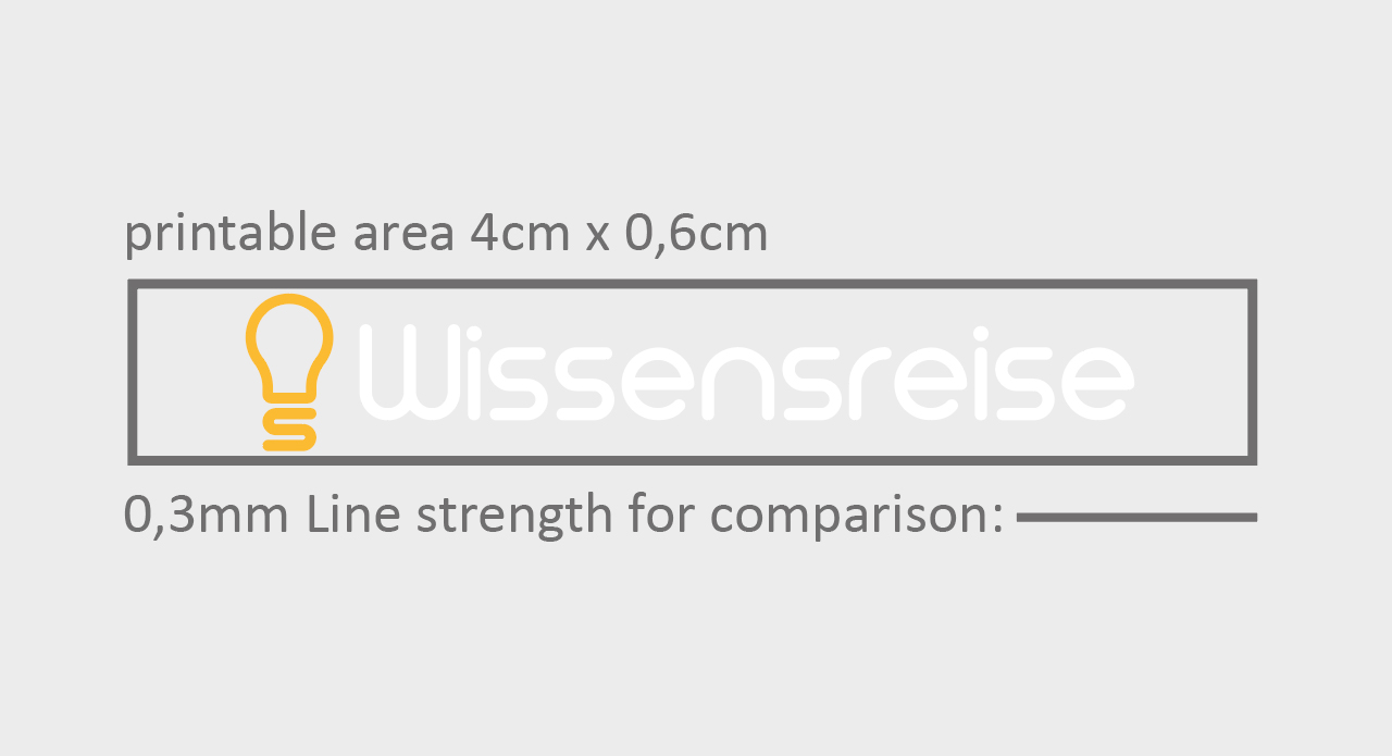
After inserting the logo into the template with the printed area, you will notice that the logo is much too big. To resize the logo to fit the available area, first select the logo, left-click and hold a corner handle, and while holding down both the Alt and the Shift key, scale it down to the required size. If permitted in your corporate design guidelines, you can set the logo and the word mark to the same height to make best use of the available space.
After positioning your logo, check the line width. Both the logo and the word mark should not be smaller than the recommended 0.3 mm so that all elements are easily legible and fully printable.
If the line width of your logo is insufficient, you can try to enhance it in Illustrator. To do so, select the logo and click Object > Path > Offset Path. The Offset Path dialog box opens in which you can enter the path offset. Change the value in small increments first to preserve the details and outlines of your logo.
Step 3: Defining the logo colour
First colour the logo in CMYK if the Pantone value is unknown
To colour the logo (first the light bulb in the example) in Illustrator, first set up the standard colour values of your logo in CMYK if you don’t know the values of the corresponding (Pantone) spot colour. For this purpose, open the Colour Themes and create a new swatch. In the example the swatch has the values C: 0, M: 30, Y: 85 and K: 0 For a better overview, you should name the swatch. Here, we named the swatch “Logo Orange”. We want to use white as the word mark colour.
Creating the word mark in the logo in white print
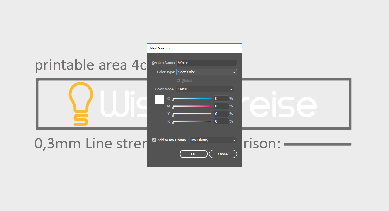
Onlineprinters has specific requirements for printing white on promotional items. First create a new swatch and set its colour to white. Then name the swatch “white” and subsequently set the Color Type to “Spot“. These settings are mandatory for printing white.
Always choose a pen colour that provides a stark contrast to your logo. In our example, we know that the logo is orange and the word mark white. To assure that both elements are easily legible in the final result, a blue ballpoint pen would be a good choice.
Step 4: Converting the CMYK colour of the logo to a Pantone spot colour
As mentioned above, the special print technique used for your promotional item requires spot colours; CMYK is not possible. So we have to convert the CMYK colour for the light bulb to a spot colour.
If you don’t know the exact colour value of your logo as a Pantone colour, Illustrator can help you. The program performs the following steps to determine the spot colours from the Pantone Solid Coated Colours system that are the closest match for your CMYK colour values.
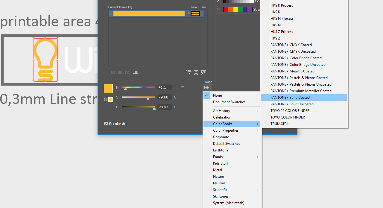
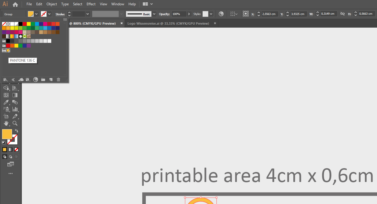
For this purpose, select the coloured light bulb, open the Color Themes again and create a New Color Group. Because you selected the logo, the orange colour will be included in the new colour group as a copy. Next click the folder icon of your colour group and then the Edit or Apply Color Groups icon.
A dialog box opens in which only the drop-down list in the lower part is relevant for you. Choose Color Books and Pantone Solid Coated. Confirm your settings with OK. Open the Colour Themes again and move the mouse over the orange swatch inside the new colour group.
It should have been replaced with the corresponding Pantone colour value by Illustrator. In our example, the orange was converted to Pantone 136C.
Step 5: Exporting the logo
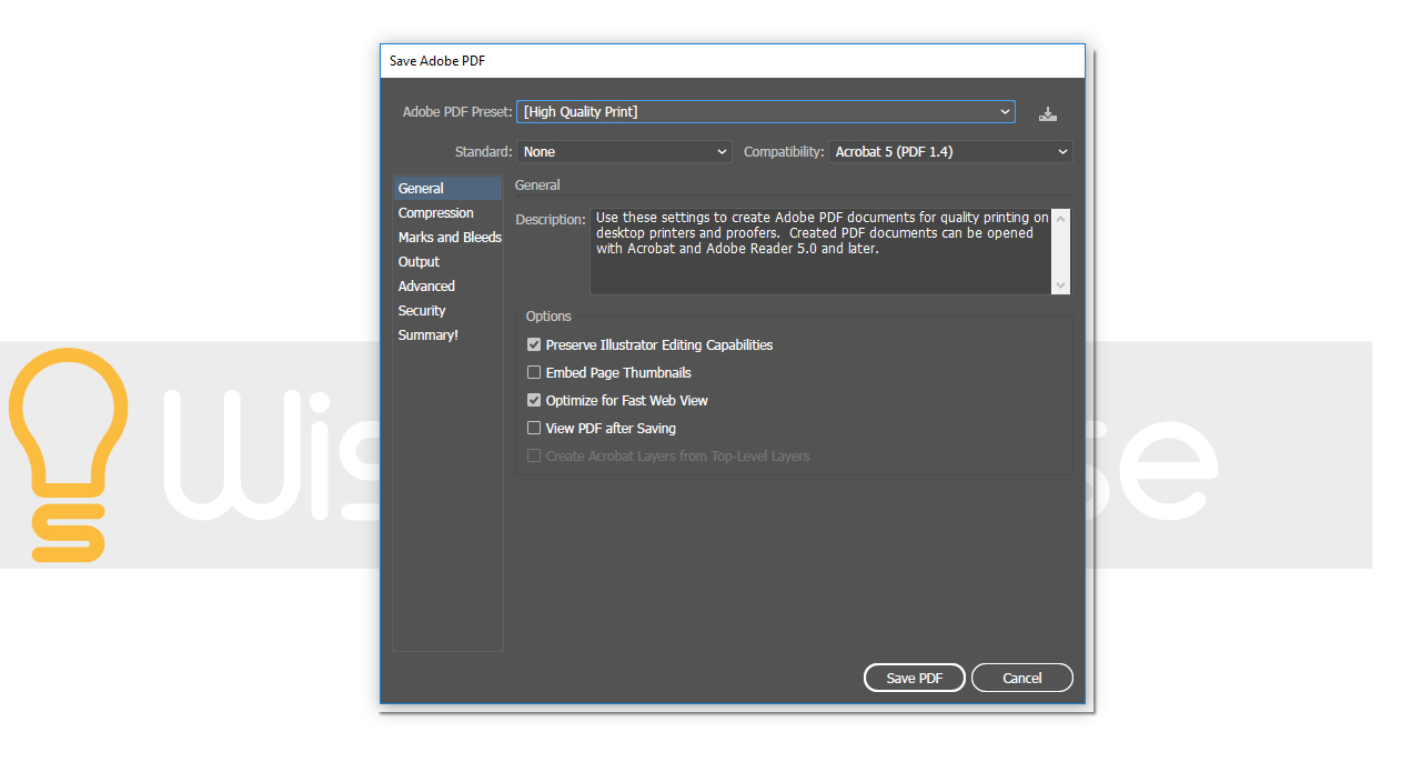
The product configuration of the Onlineprinters web shop specifies that the artwork must be submitted as a PDF file. If you have used the template which includes the printable area, hide everything except for your logo in the Layers panel. Next click File > Save as. Choose the PDF format in the dialog that opens and click again Save. In the following dialog box, specify that the project is a high-quality print and set “No conversion” on the Output tab. Then click Save to export your logo.
Note: Make sure that the file you want to export contains only the content you want to be printed. In this case, only the logo in the specified colours will be exported without any additional layers or other elements.
Step 6: Checking the artwork
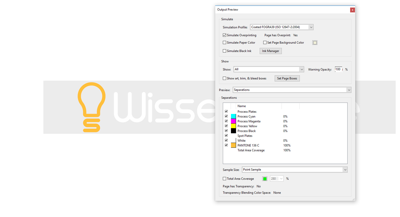
After exporting your print project, you can use Adobe Acrobat Pro to check whether all print requirements are met. To do so, first open your PDF document in Adobe Acrobat Pro and click Tools. Here choose the Print Production Tool and click Output Preview in the right pane.
As soon as the Output Preview window has opened, you will see the set up spot colours in the bottom list. Mover your mouse over the logo to verify that it is in the right place. In the ‘Wissensreise’ logo in our example, the Pantone colour value 136C is displayed as 100 percent when moving the mouse pointer over the light bulb. If you have done everything right, you can now zoom in on your logo and it will still appear razor-sharp.
Credits:
Tutorials (text and video) and design by media designer, Christoph Ullrich.
